Basic Difference between Desktop Website and Mobile Website
by Michael Phillip · November 29, 2016 Website Design Idea

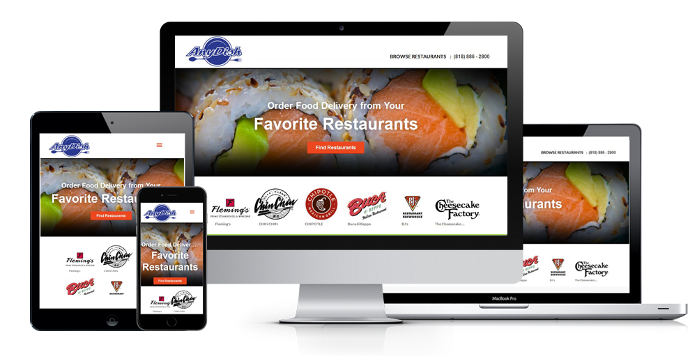
Difference between Desktop Website and Mobile Responsive Website Design

When we browse a website we have lots of ways to browse it. Some user PC, mobiles as well as many other devices. The most compromising fact that there are a good number of differences we can see at the time of browsing a website by a desktop or by a mobile device.
Lets have a look on the basic differences between browsing a website through desktop and Mobile devices
Content View From Desktop and Mobile Friendly Website:
A desktop that has a screen resolution like 1024 x 768 screen resolution has a great difference in designing a Web site for a phone with a 320 x 480 screen resolution. A desktop Web site usually contains a huge amount of information as well as the content. On the other hand mobile responsive website usually include only the most crucial and particular functions and features of the website. The mobile website must be designed giving priority to content friendly. By observing the customer needs the whole architect of the website should be implemented
Hypertext for Desktop and Mobile Friendly Website:
While browsing a website through a desktop a signature component is seen of the website. At the time of browsing internet by mobile phone no hypertext is seen. It is important when a user click a link using a mouse on a desktop computer. It is hard to tap links using the fingers of a person on touch screen mobile device. A User can easily activate a link which is not his objective. Suddenly landed on an unwanted page. It is a great problem for any user as it treats them very hardly.
Bars Tabs Buttons for Desktop and Mobile Friendly Website:
From the law of Fitts’s we know that the time required to acquire a target area is a function of the distance to along with the size of the target. Some larger objects like bars, buttons or tabs allow users to tap with more precision. It is necessary to make the objects on mobile sites huge and easily to notice. So it is a bad effect of browsing website by any mobile device.

Graphics Display at Desktop and Mobile Friendly Website:
In a website designer use many kinds of graphics for various sorts of issues like marketing, promoting the webpage. Mobile sites avoid using promotional and marketing graphics and use minimal graphics for navigation. Sometimes a company has a logo for their identical purposes. Any user can press it to go to the home page of the company. There are a good number of reasons for this transition from many graphics. Some mobile devices don’t have the ability to support the software those were traditionally used for Desktop Website design. Moreover the tiny screen sizes of mobile devices and the limited available screen real estate in which to display content, as well as the slow download speeds on mobile devices. Desktop Website and Mobile Responsive Website are create difference by graphics also.
Provisional and global exploration:
Now a days there are different types of navigation are available browsing on desktop Websites. Among them some are global which are consistent across a site. On the other hand some of the others are provisional and different depending on the users who are on a site. Besides, most of mobile phones have global exploration as well as provisional navigation is unique and limited on mobile browser sites. However, a lack of global and contextual navigation may cause a user to find him in the middle of nowhere or not knowing where he is. So, it is useful to reduce grouping when designing the content on mobile sites. That is why a user don’t need to have to cut too deeply so that he can get things done. He must be able to gain what he needs to conclude before becoming hidden.
Footers Display For Desktop and Mobile Friendly Website:
There are two kinds of footers that are in used on Desktop Websites. Among them one kind of footer provides such links of content so that a user might wish to view on a websites home page. Though it provides link but it has a less preference than the elementary content on the home page. On the other hand there is another type of footer which arranges quick links to content to a user for common need to view most usually. Now if we talk about Mobile friendly websites it engages footers which provide access to content to a user usually look for on a home page. Moreover it keeps its links to a merest rate though it does not use footers carrying quick links.

Momentum Indicator:
If we look at desktop Web sites, we can see a user can Easily progress by the help of multiple steps so that he can finish a process in which he is purchasing a product otherwise he is filling out a huge registration form. For assisting the users with the help of this process there is a momentum or so called momentum indicator. Mobile device has limited space .This is why this progress indicator is not appeared while browsing thorough mobile devices. It uses other approaches to make a user of his momentum without a momentum indicator such as contrary to use buttons with definite actions like Next or Continue use buttons with improper labels that inform a user exactly what the next approach will be .The user will get the information about the next step each by each.
Bread Crumbs:
It is a type of text based website which breaks the site into links of sectors as well as sub-sectors. It allows main sectors of information to be attached in a number of pattern orders. It is displayed to the user so that they can find easily the exact location of the web page within the web site. In a desktop website, it is the best way to ensure a user that he is on the right track of finding his desired webpage. It also gives the opportunity to backtrack on his navigational path. But in a mobile device it is appeared in a rare rate. Moreover, it is not necessary for mobile website. One of the most important fact is the design of a mobile sites don’t provide a user not to have a close analysis to search what he is looking for. Besides mobile sites have limited space breadcrumbs is not a common issue on it. Breadcrumbs in a mobile are also rare as the relatively flat structure of some mobile websites.
Provincial Search:
A unique area of mobile website is the use of location service. When it was available for a short time of period, it was highly accepted by the customers. So, it is regular place for applications of mobile phones and Web sites to take the benefits of this function by unifying it into value-adding services such as mobile search. Now days there are many mobile devices that can identify where users are, it also provides them local search results. This capacity endeavors a great opportunity for traders to advertise their products or services occupying on a person’s adjacency to their place of trades and their actual firm.
In an overview of the above discussion, a desktop website is more helpful than browsing a website by a mobile device. It mainly depend on the users mind what type of information they need to browse from any of the web browser.


